SIDE B: Visual File
" transform="translate(2.735 2.895)" width="55px"/></svg>)
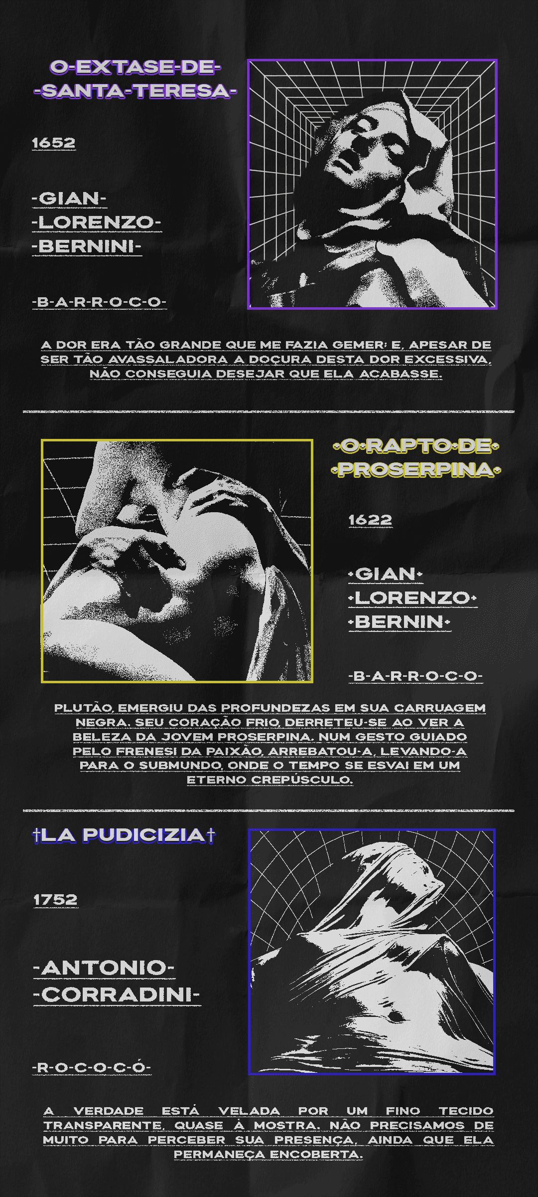
Brutal Baroque
Here I gather some of my most authorial works, exploring a style that I greatly appreciate, Brutalism in Design.
Blending sculptures from the Rococo and Baroque, their delicacy and expressiveness, with the Brutalist aesthetic, raw and rough, I created this project.
The parts I selected from the sculptures show the details that caught my attention the most: the expression, the strength, and the mystery. Together with the texts, where I tried to convey the feeling of each work, whether with the words of Saint Teresa or with my interpretation of La Pudicizia.
Since this is my first project in this style — which later became my main style — I obviously made some mistakes. The pattern behind the face of Santa Tereza is crooked in relation to the frame, and there is also a difference in treatment between her image and the others. The texts are cut between the lines, which can hinder the reading speed. Not to mention simpler things, but that still make a difference, such as the distance between the data next to the images.
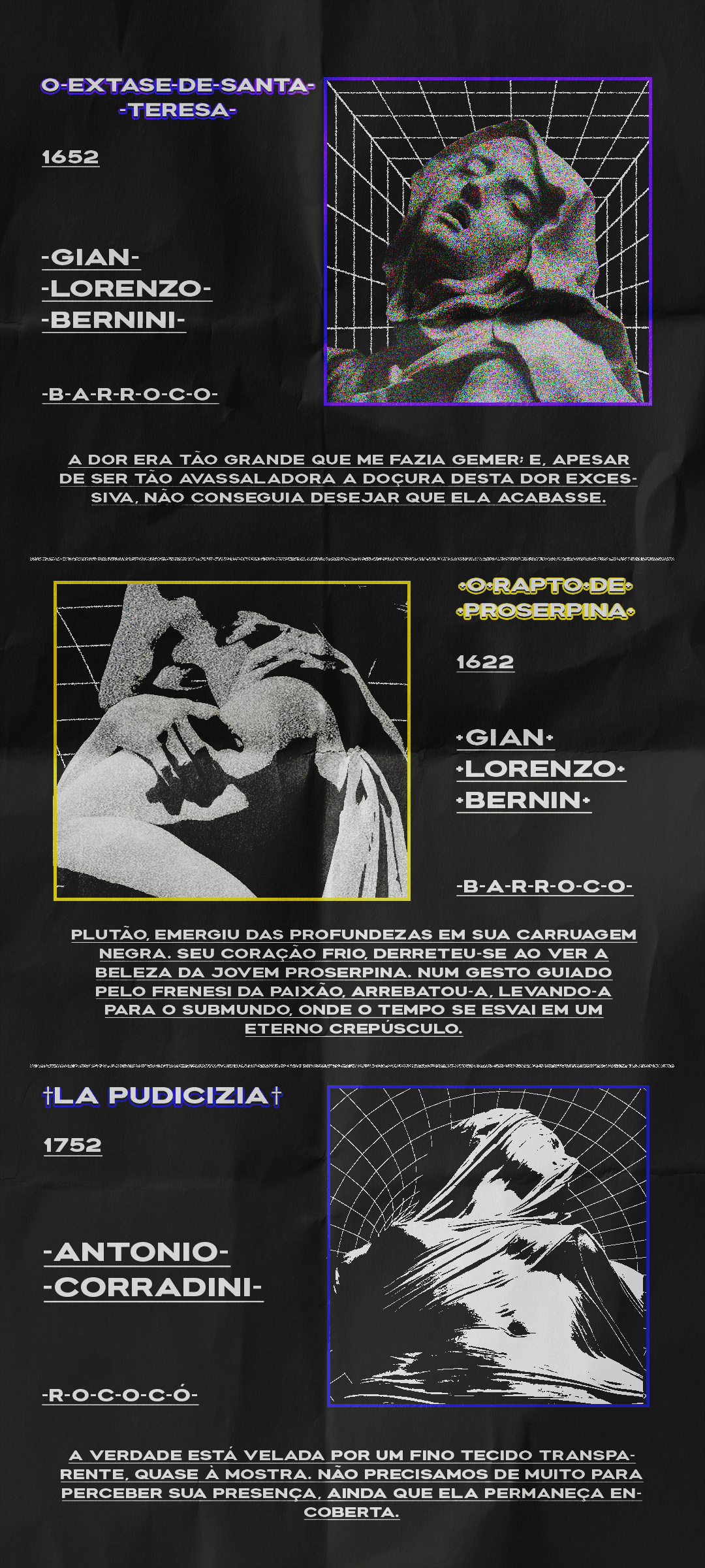
Keeping in mind the errors in the previous version, I decided to reshape the effects applied to the works for a better standardization among them. Additionally, I aligned the side texts of each work and adjusted the paragraphs below them, leaving whole words throughout the paragraph.
Below you can check each section individually.
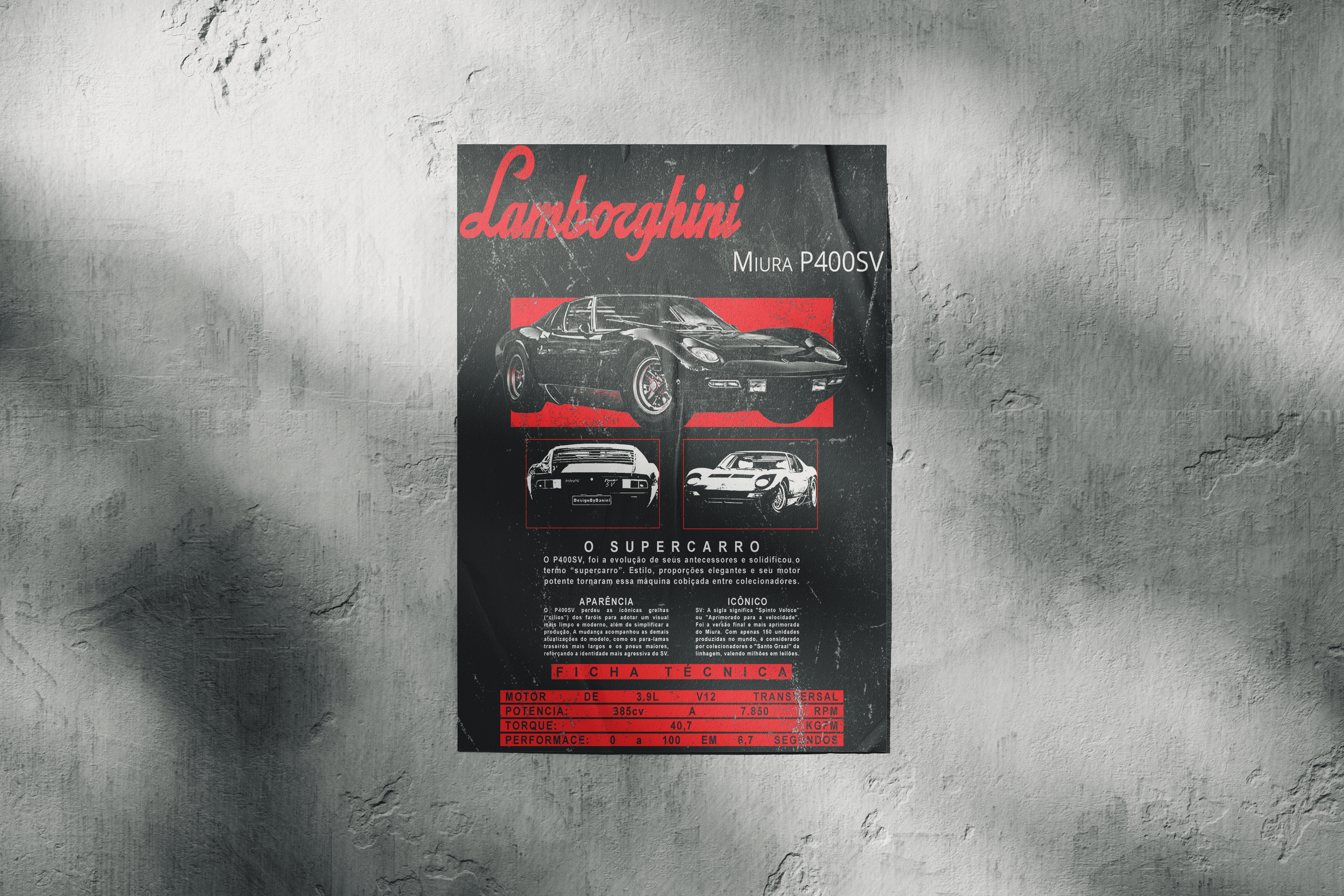
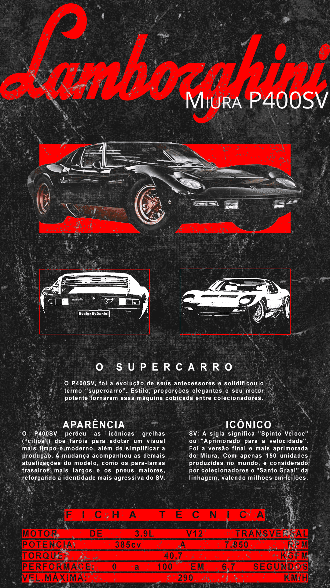
Lamborghini Miura Poster
Still in my studies on Brutalist style, I created this poster to test some ideas I had regarding visual composition and grid organization. And why not use a car that made history for that?
In the texts, I talk a little about the history of the model, its characteristics in relation to previous models, and its rarity in the world of collectors. In the technical sheet, I included every detail of this machine, such as torque, maximum speed, and performance.
Although I was satisfied with the final result, I think that in a second version I can improve some things, such as adding a colored version of the black and white cars, slightly increasing the text size, and changing the contrast of the technical sheet.